Thursday, December 27, 2012

Hero Photography for Corporate Safety Campaign

See last year's campaign
Kimberly-Clark is a world class corporation that makes many of the brand name products you might use everyday like Kleenex, Huggies and Cottonelle. Every year they have a Safety Campaign aimed at maintaining the safety-culture of their company. Last year I took a set of photos of workers decked out in Personal Protection Equipment, or "PPE" as it is known in the biz. See previous campaign.

This year, the theme changed slightly from workers in the factory to family members. It was decided to use a young child and his father for the "hero" photo. This was a real father and son to make it more realistic, and it was probably the only way to do it. The young boy was no more than 5 years old so we would be fighting a short attention span. Having the parents there would help me coax the emotions that the art director was asking for. This is was challenging for many reasons.


The concept for the photo was that the boy would be seen hugging his father dressed in Dad's PPE which consisted of safety goggles and vest. This is where the process got fun. The art director wanted black hair and a black shirt on a black background. Not only that, the boy was to wear wrap-around, highly reflective safety glasses that reflect EVERYTHING! I knew this was going to be a challenge to light.

In all, I used 1 softbox, 1 umbrella fill, 1 horizontal strip light and 1 gridded spot light and some reflectors. Removing any of those would have made parts of our subjects fade into the black background especially the hair.

All the safety goggles were highly reflective and showed all my studio lights. The highlights had to be managed.
We tried 3 different sets of goggles to give the art director a choice, and soon we were done. I tried every trick in the book to get the right expression from our young talent... I even bribed him with a robot from my childhood toy collection. Talk about going the extra mile.

The retouching phase of the project got a bit "hairy" as I removed individual stray hairs, and gave the Dad a hair cut. Below is a BEFORE and AFTER detail of the photo.

BEFORE Retouching
This process involved rebuilding the shirt collar and skin texture on the neck, plus adding back digital hairs in certain locations. I also removed a major unavoidable softbox reflection and added some color to the boy's eyes. Overall, I am very pleased with the results given the circumstances.
AFTER Retouching
This poster will be translated into 21 languages and hung up in factories all over the world. Pretty cool.

Wednesday, December 26, 2012

Maternity Photos with Marie & Justinas


Justinas and Marie are two of my oldest friends in Atlanta. I have know them since the days when riding motorcycles in the north Georgia mountains was a weekly event. We spent many a mile together and had some great adventures. It was wonderful when they got married and then pregnant later on.


Justinas and his brother, Paulius, are photographers just like their father back in Lithuania. The love of photography is something that we all have in common. Justinas was making a movie of the shoot.


I was honored to be able to take some of these photos of Marie, but I wanted to include Justinas in some too. He is always behind the camera so this time, the roles would be reversed for him. I also thought it would be important to show them as a couple. I love the negative space between them in the next photo.


We decided to meet at my office where we could take advantage of an open studio and also the last remaining Fall foliage outside. Many trees had already lost their vibrancy at this point, but I put my secret weapon to good use... I simply call it the THE TREE. This one always has incredible color.


My favorite tree in Atlanta still had a little Fall color left... but only if the sun hit it just right. The same tree is in the background of the image above and below. The only difference is that sun peeked out for a few brief moments on the latter one. I call this "boom pow" because this kind of color knocks me out.


Pretty soon the evening light was toast so we headed indoors to try a few different scenarios. The first was to photograph Marie against a painted blue wall using a ring flash. If you have never seen one of those, it would look similar to sticking your camera lens through the hole of a large doughnut shaped flash. It creates a signature ring highlight in the eyes and a soft shadow around a subject who is in close proximity to a wall. This look is not for everyone, but Marie pulls it off.


Then I wanted to try some dark background portraits with strong directional light. We used a sheer mesh here.


I wanted a very strong rim light to help define her against the dark background.


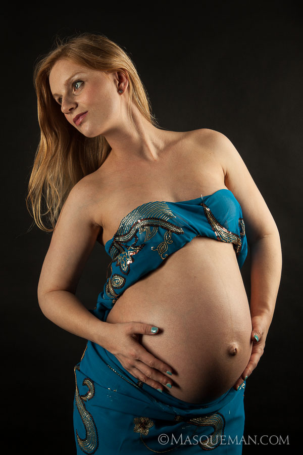
She then changed into something a little less comfortable. How she wrapped herself in this thing is a mystery, but I think I saw her twirling into it while Justinas held the end.


This is one of my favorites because of the modeling on that perfect belly, and the expectant look of motherhood. She will make an incredible mom.


Tuesday, December 25, 2012

Web Site Design for BeWell USA

I was hired by BeWell to create two versions of their company web site. This company sells products all over the world so each site had to be tailored to the host country since they sell different products, have different regulations and contact procedures.

BeWell USA web site

As a money saving strategy, we decided to build one completely, clone it and then change the information for the remaining country. In fact, this process was so efficient that we plan on rolling out several product-specific sites this way. This was the perfect plan to get a lot of web sites built in less time than normal. Visit the USA site at www.Bewell-USA.com

Head Shot Portrait for an Atlanta Doctor

This is one of those cases where I needed to match a style of portrait that I took several years before. Luckily, I meticulously measure the position of my equipment, flash power and camera settings for every job I do. That way if an office manager says "we need a photo of our new doctor and we want it to look JUST LIKE the ones you took 2 years ago, I can do it.

I have even kept old studio flash sets due to recurring jobs... even though I have much more capable and expensive gear now. The bottom line is that it is faster for me to set up the old stuff instead of recalibrate a previous setup with new gear. You can decide for yourself if that makes me smart or lazy.

Web Site Design for BugBand Insect Repellent

Every couple of years, I get to update the web site for one of my oldest clients, BugBand Natural Insect Repellent. I went very colorful with an emphasis on green which is now a major direction for the retail packaging and displays.

My favorite enhancement to the site is the new graphic headers on many of the pages. I wanted to show the various situations where the products could be used. Visit the site at www.BugBand.net.

Package Design for Ice N Heat Ultimate Combo Product

I love package design because it is a challenge to grab the attention of consumers in a busy retail store. People tend to make up their minds in a split second or two.

How does one balance the product name and image, key points, primary and secondary branding, box orientation, special callouts, required information etc. etc.?

Here is the final box for Ice N Heat's Ultimate Combo which is a unique hot and cold compress product. It contains 2 types of compresses that attach to the same body wrap using velcro. Anyway, there is a lot the box front needed to say, and it was like a puzzle to get them all to fit. This is version #18... which is shows how many layouts and alternate text versions were tried.

This particular client, BeWell USA, Inc., makes their own health-based products, but also makes private label versions on request for pharmacy chains. This is a factor in the design that required that I keep the primary branding area easily changed out with different logos.

This project included graphic design, photo retouching, illustration, copywriting and marketing... the whole shebang.

Corporate Headshots and Executive Group Photos for Q-Spex

I get to make a lot of headshot portraits for corporate clients. Instead of the client coming to my studio, it is usually more convenient for me to show up at their office with a portable setup. Scheduling is always an issue with busy executives so we time the photoshoot on a day when everyone is in town.


To make the photos consistently sized, I visualize the final proportions of the portrait. Sometimes I crop the photo very tight if it going to be used for low-res applications such as websites. That way, the face is larger and easier to see.


It is important to be fast and efficient when making these portraits. The last thing you want to do is waste the time of someone who has meetings planned all day. To do this, I shoot with my camera tethered to a laptop computer. As soon as I take the photo, it is transferred to the computer where we can review it. After several shots, we pull all the photos up on screen, and we pick the best one... usually by process of elimination. It is rare when we do not all agree on the final choice.


When I first visited the QSpex building, I was drawn to the front entrance that had a sitting area next to a huge window. Window lit portraits are things that photographers dream of... unless the sun is pouring in like bright white laser beams as it was that day.


The day we showed up was overcast which was very lucky indeed. I still could have made it work with  bright sun, but maybe not without a more complex multi-light setup. There was no time for that since one of the executives had a lunch meeting and had to leave. Nothing like performance under pressure, but that is always part of the game. I set up a huge and high umbrella and fired off several frames concentrating on the placement of the executives. The basic photo is below marked with things that I did not like.


I am not a photo journalist so I am not bound by truthful reality. If I think I can make the final image better by retouching, compositing, tweaking or outright removal of distractions... I will do it. Of course, I do share this fact with the client and let them see both versions... just in case they like fire alarms and closet doors. The cleaned up image is below.


I knew we would be making a web site for QSpex also so I wanted to make sure I could use the group photo in a web banner which has more of a 16:9 aspect ratio. See it still works this way.


And finally, the image must work as a black and white photo. I often turn images to grayscale to make sure that they have enough detail and contrast to work without color.

Monday, December 24, 2012

Photos of an Amazing Miniature Baptism Dress

I was asked to make photos of an exquisite baptism dress before it got used. I know that I am a guy and that I should not get excited about lace and stitching. The thing is, people rarely go through this much trouble to make things themselves anymore. Most of us would go to Babies R Us and be done with it.


I cannot imagine the hours spent piecing all the parts together. This kind of craftsmanship is so old fashioned and I think that is pretty cool. 


The lace inserts are floating in the middle of the fabric. You can barley see the stitches.


Web Site Featuring the World's 1st Biodegradable Nitrile Glove

One of the hottest topics today in business is "being green". This can involve saving energy, recycling,  using recycled materials, or reducing waste products. Showa Best Glove has hit a home run with their latest hand protection product called GREEN-DEX at www.Green-Dex.com. I got to design the web site.

Why is a Biodegradable Disposable Nitrile Glove So Important?

Disposable nitrile gloves get used and thrown away by the millions per year. Imagine a job requiring constant glove changes by a single worker. Now multiply that number by a large workforce over a year's time, and one can see the result will be staggering mountain of gloves and tons of waste material.

Little things add up to be a lot of space in a land fill... especially if they do not quickly break down when exposed to wind, rain or the tiny organisms that turn a pile of trash into dirt. The chart shows how much faster Green-Dex breaks down compared to standard nitrile which barely moves at all on the scale.

GREEN-DEX™ packaging is also made from 100% post-consumer waste
and dispensers from 100% recycled material.

Different Materials Can Take Many Years to Biodegrade in a Landfill

I find it interesting to see how long everyday items take to biodegrade and the chart tells the tale of common things we throw away everyday. If this does not convince people to think more seriously about recycling, I am not sure what will.

ProductTime to Biodegrade
Apple core1–2 months
General paper1–3 months
Paper towel2–4 weeks
Cardboard box2 months
Cotton cloth5 months
Plastic coated milk carton5 years
Wax coated milk carton3 months
Tin cans50–100 years
Aluminium cans150–200 years
Glass bottlesUndetermined (forever)
Plastic bags10–20 years
Soft plastic (bottle)100 years
Hard plastic (bottle cap)400 years

All this talk about trash reminds me of my favorite commercial from the seventies...

Family Photos with the Humphreys in Atlanta


I have known Lisa since the 90's when I worked with her at my day job at Graphic Works. A lot has happened since those days, but one thing has remained the same. She is one of the nicest people that you will meet, and she has a zest for life. She's Italian... what did you expect.


Her two children, Graham and Marissa, have the same adventurous spirit, and they are just fun to be around. Every couple of years we get together for a photoshoot and to compare how much bigger the kids have gotten. I do not know what she is feeding them, but they are growing like weeds.


Here are a few photos from that day. The Fall colors were not really in "bloom" yet in Atlanta, but they were on the verge of changing. The day was very overcast which I prefer over too-strong sunlight. This can give a hazy feel to the photos and the colors don't pop as much as would strongly backlit leaves.


I hope to keep doing this with them for many years to come. It will be great to look back and remember the journey. To see last time's photos, check out the previous Gallery Link here.


It is not hard to figure out who Marissa will look like when she grows up.

It was a very nice day spent with old friends.


Sunday, December 23, 2012

Corporate Group Photo in a Narrow Gray Box

Sometimes the locations where I am hired to make portraits are not very exciting. Let's be honest, many American corporate offices are basically gray painted boxes. In the case below,  it was a narrow conference room in which I needed to make an eight person corporate group photo.You cannot tell form this angle, but I would have been hard pressed to squeeze behind the subjects.


Because of the tight confines of the room, my only option was to set up two large strobes to the right and left of me at the close end of the table, and push light into the room. This was not ideal because of the glass display at the end of the room showed the reflections of the strobes very clearly. Also, the frame rate of the screen was giving me weird partial images. In the end, I just decided it was faster and more efficient to put the logo in post-production.

People have asked why I did not just use the fluorescent overhead lights to make the photo. There are a few reasons. First  fluorescent lights flicker unevenly and can cause issues with exposure and color balance. Those can be overcome, but it just adds complexity to the shoot. Secondly, there is not as much light as you might think in the room. Human eyes are much more sensitive than the sensor in my camera. Even at high ISO settings, I would have to set a longish exposure... not good for sharp shots of this many living, blinking people.

Flash captures the scene in 1/100th of a second freezing everyone perfectly. It allows me to control the color and shape of the light more easily, and in this case it made it possible to get the strong reflections in the table... the most interesting part of the photograph.


My Philosophy on Photographing Children

Photographing children is as much psychology and timing as it is a little luck. And, I am not just talking about child psychology either. Dealing with the parents can be just as challenging.

The final usable portrait of Tyler
I once heard a parent threaten their crying child by screeching "Do you want a spanking? If you do not sit there and smile, you will be in big trouble! Quit fidgeting and smile for the camera! Stop crying! You are going to get it when we get home".

You don't have to have a PhD to know that this is going to end poorly with either terrified looks, tears or even therapy many years later. Take a chill pill folks... Let kids be kids.

My approach with children is a bit more laid back. I play games with them. I ask them silly questions and make them forget that we are making their portrait. The thing that many adults forget is that children are creative creatures that may come up with a better pose or facial expression all by themselves without being told what to do every second. Sometimes, you just have to get rid of the "sillys" before you can take the portrait, as the photos below clearly show.

Tyler has a lot of personality. I have more silly photos than serious ones... 
I try to get the standard posed shots and then see what the kids do. You just might be surprised what wonderful characters they become. Creativity and personality should not be squashed by overbearing parental behavior. It's my opinion that sometimes the totally wild photos become our favorites many years later.

My own mother told me that her favorite photo of me as a child shows me crying because I did not like the surly Sears photographer who was trying every trick in the book to make me smile. The story only makes the photo better. Thanks Mom.

Full disclosure.... Tyler is my nephew and nobody was yelling at him except maybe his little sister, Sara. Here she is demonstrating the perfect smile. Oh man, I can't wait to embarrass them when they are teenagers.